SaleBest seller
Estate Check
placeholder
Print families
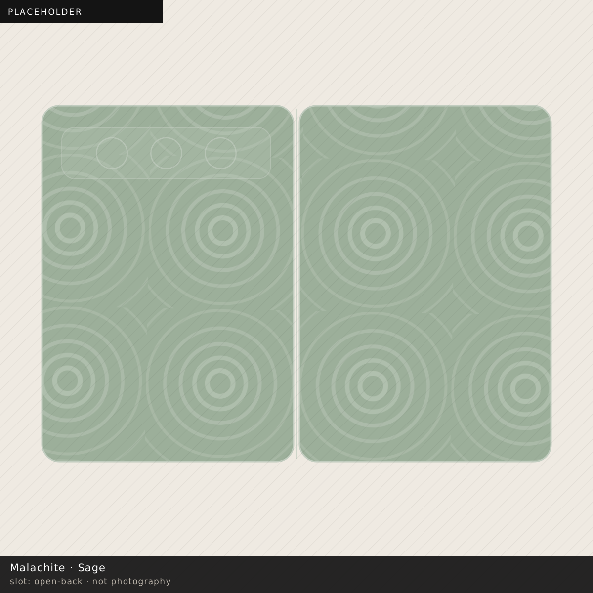
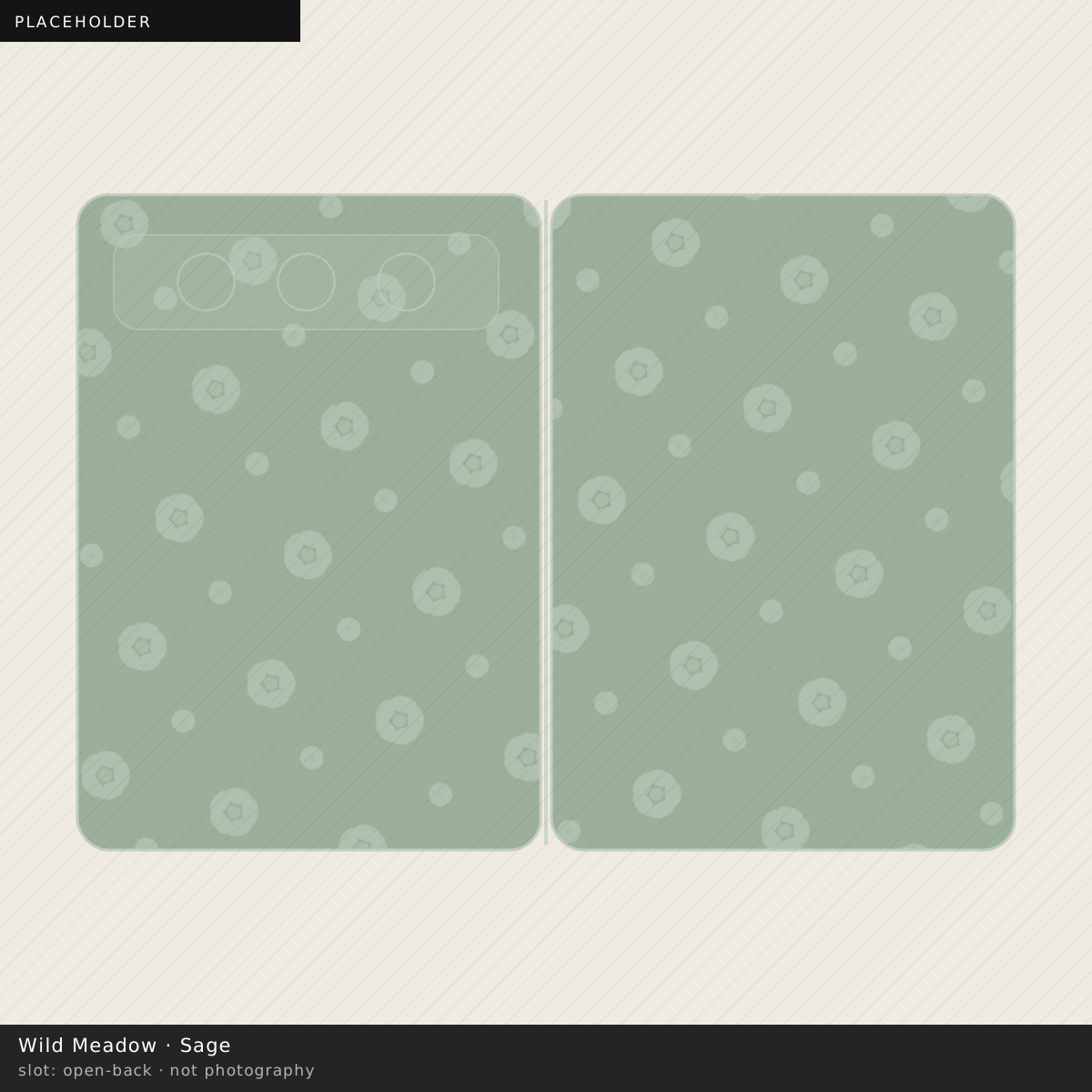
A green with grey mixed through it, which is the only kind worth having.
18 cases
It is a mid-tone, so it sits where oat does — more forgiving than ivory, less than black. The grey in it helps: a scuff on a grey-green reads as part of the colour rather than as a lighter patch.
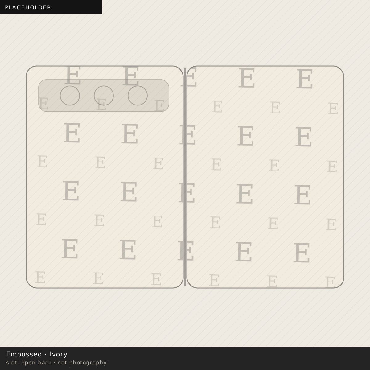
Embossed. A blind emboss has no ink at all, so on sage it is a single colour described only by a highlight and a shadow. It disappears in flat light and appears when the phone is tilted.
Yes, and better than most colours do. Grey-green and warm gold is a pairing that has been in interiors for two centuries for a reason.
Most phone-case greens are too saturated. They are mixed from a screen palette rather than from a paint one, and the result reads as plastic in daylight because nothing in the physical world is that green except a highlighter.
Sage has grey mixed through it. That single decision pulls it toward the colour of a painted door or a soft-furnishing sample and away from the colour of a road sign, and it is the difference between a green case you keep and one you replace.
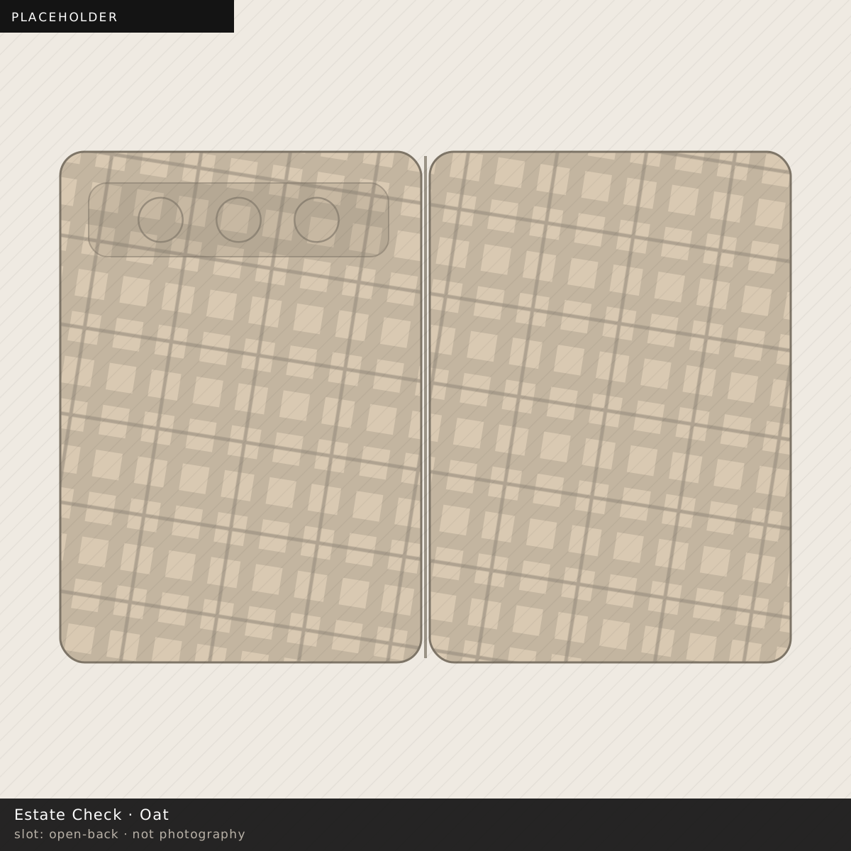
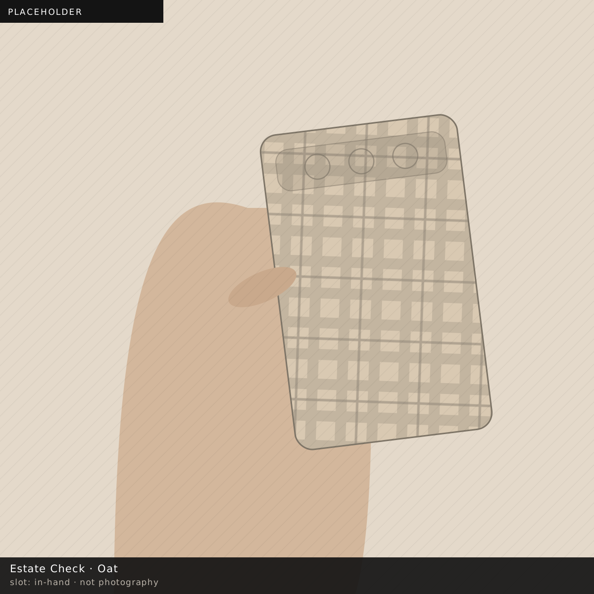
It behaves like a neutral without being one. A floral on sage reads as a botanical study rather than as a bouquet; a check on sage reads as estate cloth. That is why Wild Meadow, Estate Check and Malachite are all on it, and why it carries every print family in the catalogue.
It also does something no other ground here does: it makes green in a print disappear into the ground and everything else step forward. On Hothouse that is the whole effect.
Muted greens get sold as a spring story and then quietly disappear, which is a merchandising decision rather than anything about the colour. Grey-green has been a constant in paint, ceramics and cloth for as long as any of those have had ranges, precisely because it sits between a neutral and a colour and never fully commits to either.
It carries every print family in this catalogue, which no seasonal colour would, and that is the practical evidence for it rather than the argument.
A grey-leaning green sits against a polished frame better than a saturated one, because the grey in it picks up the metal rather than clashing with it. On the natural frame it is almost tonal. On the gold frame it is the strongest contrast in the range that is still quiet.