Choosing a print for a phone you take into meetings
It is not about being plain. It is about what a pattern does at two metres.
A phone on a meeting table is seen from about two metres, at an angle, by people who are not looking at it on purpose. That is a completely different viewing condition from the one every phone case is photographed in, and it is the condition that decides whether a print reads as considered or as loud.
Two properties do most of the work.
Scale relative to the object
A pattern has a repeat. If the repeat is small relative to the surface — say more than about twenty repeats across the width — the eye stops resolving individual motifs at two metres and averages them into a flat tone. The case reads as a colour, and usually as a slightly muddy one.
If the repeat is large — fewer than about six across — individual motifs are legible at distance and the case reads as a picture.
The middle, roughly six to twelve repeats, is where a pattern reads as texture: clearly patterned, not resolvable into subject matter, no single element demanding attention. That is the band nearly every quiet print sits in, and it is why a check at the right scale is calm and the same check shrunk is grey.
Contrast within the print
Independent of scale. A two-tone pattern with high contrast between the tones is visible further away than a many-toned pattern with low contrast, even when the second one is objectively busier.
This is the property that makes a dense floral in close tones quieter than a simple polka dot in black and white, which is counter-intuitive until you have seen both on a table.
Applying it
Quietest. Tonal patterns — the print one shade off the ground. At two metres these read as a surface finish. At arm’s length they are a pattern. Nothing about them attracts a glance.
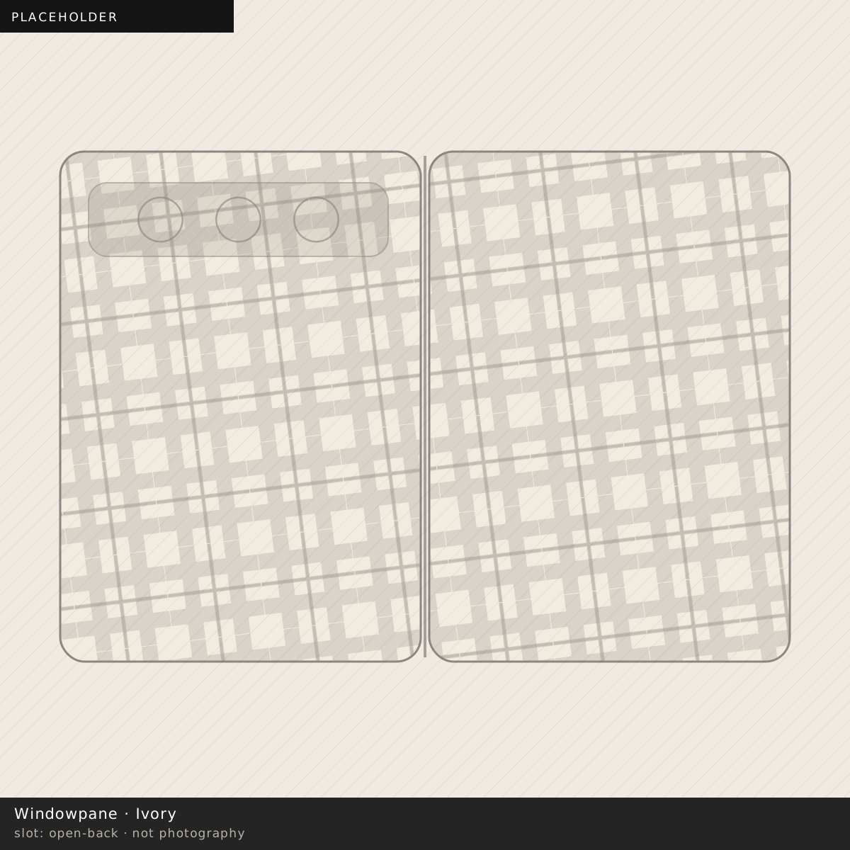
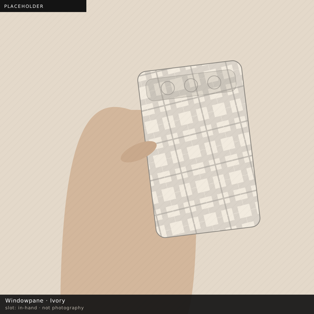
Quiet. Mid-scale, low-contrast geometrics. A fine check, a windowpane, a hairline stripe. These read as cloth, which carries an association of tailoring rather than of decoration.
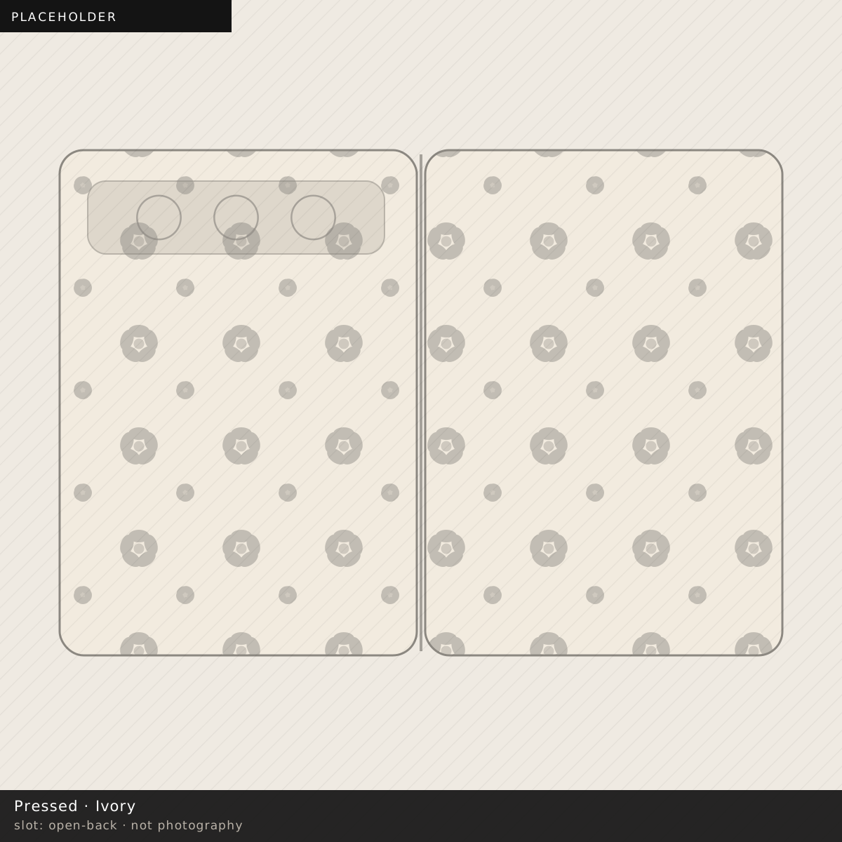
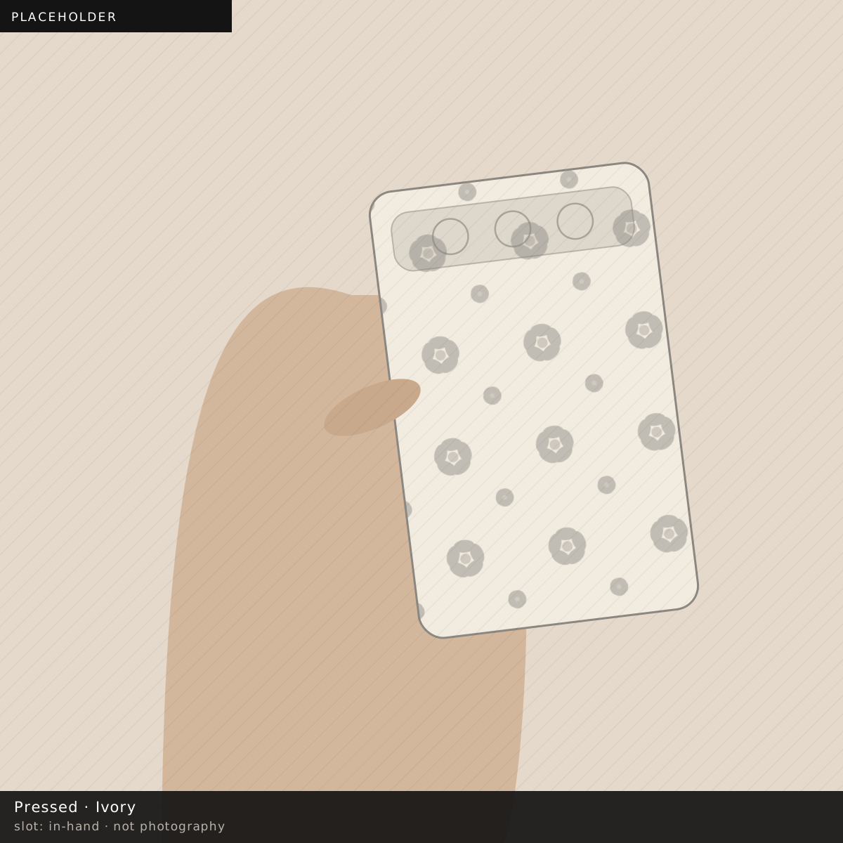
Middle. Naturalistic prints with a lot of empty ground. A single branch, a pressed specimen, one bloom placed off-centre. The empty ground does the work: at distance the eye reads mostly ground.
Loud, regardless of taste. High-contrast two-tone at large scale. A big black-and-white check, a bold animal print on a pale ground, anything with a single large motif centred. These are legible across a room and are not made quieter by being tasteful.
The thing that is not about the print
A case in a colour close to the phone’s own frame reads as part of the object. A case in a strongly contrasting colour reads as an accessory on the object. Both are legitimate; they are just different decisions, and the second one is noticed whatever is printed on it.
On a phone with a polished frame this is a stronger effect than usual, because the frame is bright and any colour next to it is being compared with it.
The counter-argument
All of the above assumes the goal is to not be noticed, which is one goal among several and not obviously the right one.
Plenty of people want the phone on the table to say something, and the calculation then inverts: large scale, high contrast, one motif. The point is that this should be a decision rather than a surprise, and the surprise is what happens when a case is chosen from a close-up photograph and then met at two metres.
What the ground colour does on its own
Print aside, the ground is doing something at two metres that nothing else is, and it is worth separating from the pattern question.
A pale ground reads as larger. A case in ivory or oat on a table takes up more visual space than the same case in ink, because the eye reads a light object against a dark table as an area and a dark object as an outline. On a folding phone — already a bigger rectangle than the people around the table are used to — that is a real effect rather than a subtle one.
A dark ground reads as the phone. A mid-tone reads as an object. A bright ground reads as a decision.
None of those is wrong. But if the intent is for the phone to not be the most noticeable thing in front of you, ground beats pattern, and a loud print on ink is quieter than a quiet print on white.
The second-phone problem
One more thing worth saying because it catches people out.
A case chosen to be discreet at work is frequently the same case being carried at the weekend, and discretion has no value on a Saturday. The people who end up happiest with a printed case are usually the ones who bought two — one that disappears and one that does not — and treat them the way they treat a watch strap rather than the way they treat a screen protector.
That is a more expensive answer than “buy the quiet one”, and it is the honest one.
A practical test
Look at the product photograph at full size on a screen, then stand up and walk two metres away from it.
Almost nobody does this, and it takes four seconds, and it predicts the thing that the close-up cannot.
This article explains a perceptual mechanism from first principles. The scale bands described are working heuristics from laying out prints at this size rather than results from a formal study, and are offered as such.